This topic will focus on the weight that the big market cap stocks represent for the entire stock market, the returns of the different sectors, flows, and the implications.
1 Like
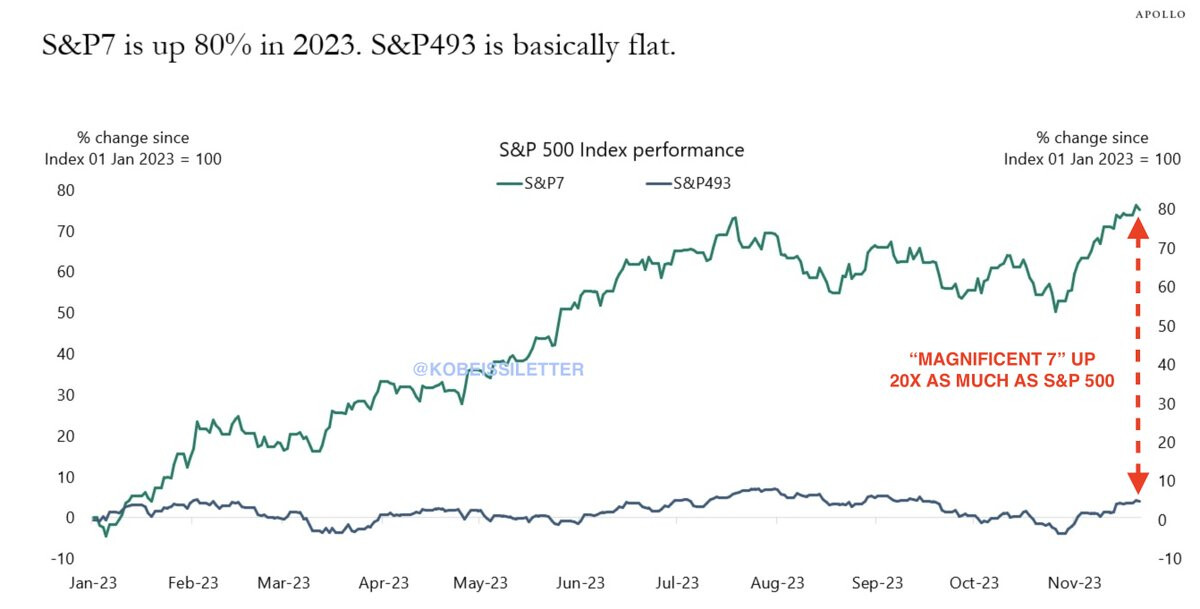
The S&P 500 is down ~10% from its recent high and has erased $4 trillion in market cap in 3 months.
Meanwhile, the S&P 7, which reflects 7 tech stocks in the S&P 500, has lost ~$500 billion in market cap.
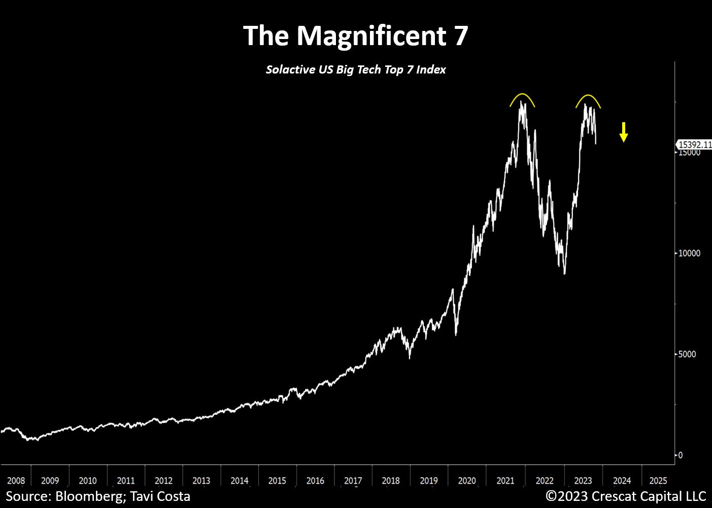
Currently, the S&P 7 reflects a record 29.6% of the entire S&P 500.
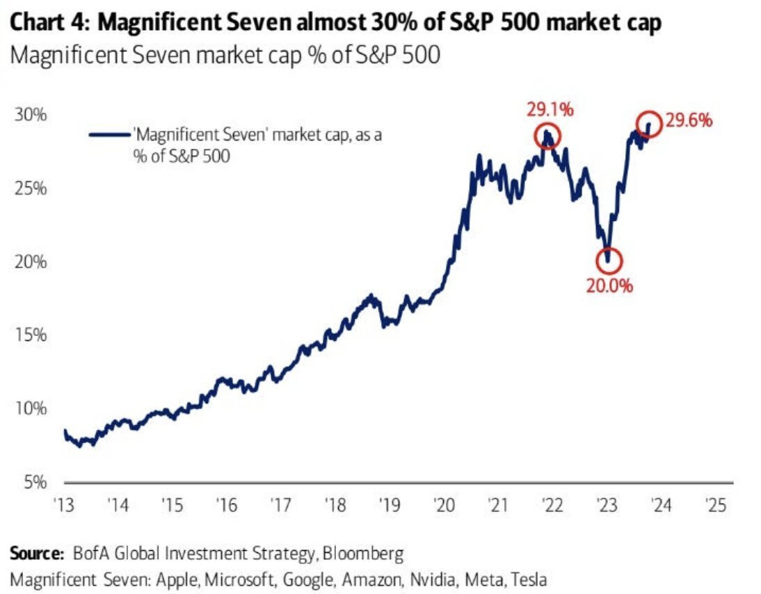
https://twitter.com/KobeissiLetter/status/1717572908720050589/photo/1
1 Like
200 moving average is the most used technical indicator to asses if certain security is in an uptrend or downtrend.
Currently, only a small minority of stocks remains in an uptrend according to this metric.
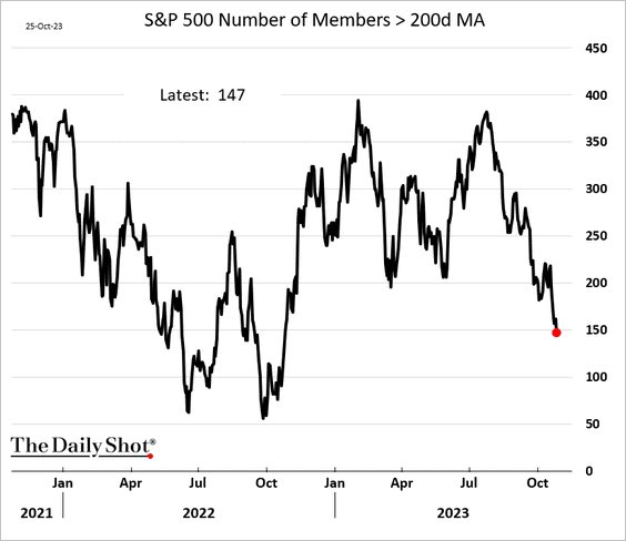
https://twitter.com/WinfieldSmart/status/1717510526018699705/photo/1
1 Like
Hedge fund net exposure to magnificent 7 was 12% at the start of the year. It is now 99%
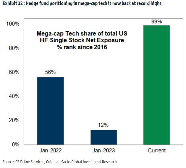
https://twitter.com/zerohedge/status/1724847458667078093/photo/1
How is that defined?
This means that current exposure (share of their portfolio) is higher than 99% of periods since 2016. This does not mean that buying can’t continue to increase, it just means the current exposure is already very significant compared to what they usually hold since 2016, probably a very crowded trade already.
1 Like
Good to know. I think having this kind of context is very important because just looking at the picture and the text within it or even the original tweet it is impossible to understand for most people that it is referring to the fact that exposure has been higher than in 99% of times since 2016.
Obvs.in less actively managed funds the higher exposure compared to 2016 would simply be a result of the overperformance of the significant 7 and not necessarily a result of active portfolio changes so the fact that has been only higher than 12% of times since 2016 at the beginning of the year is the remarkable insight.
While we cannot always chose the kind of data we find and some relative insights is better than nothing absolut numbers would be like always more valuable (the %share of portfolios in 2016 and 2023) because with this relative indication we still have no idea what the starting base in 2016 was or what the current level is.
1 Like
The literal visualization of “bad news are good news” since October. This for the implications it has had on yields and expected rate cuts.
https://twitter.com/CameronDawson/status/1727443723313959165/photo/1
1 Like
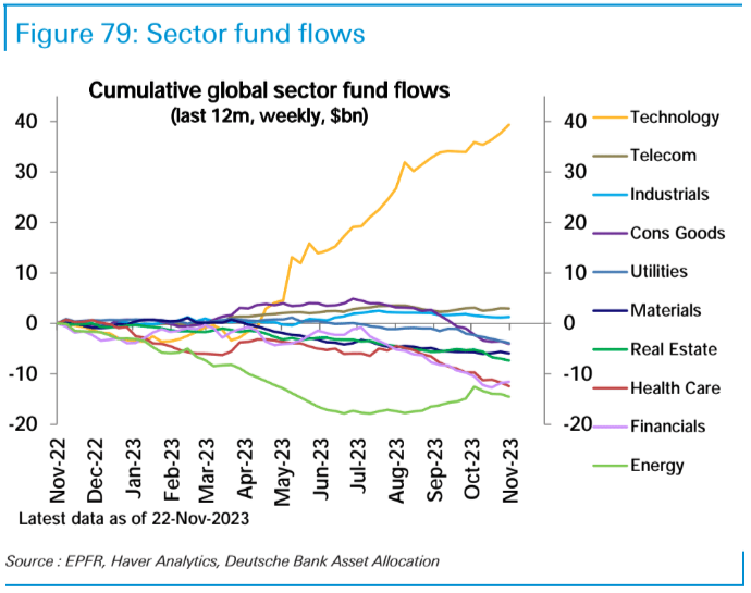
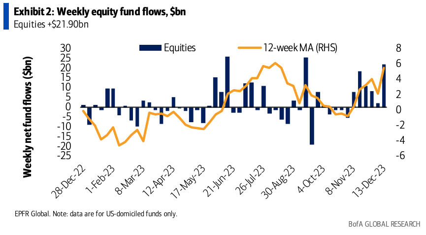
Basically, most of the money has gone to tech this year.
https://twitter.com/dailychartbook/status/1729514734699827616
2 Likes
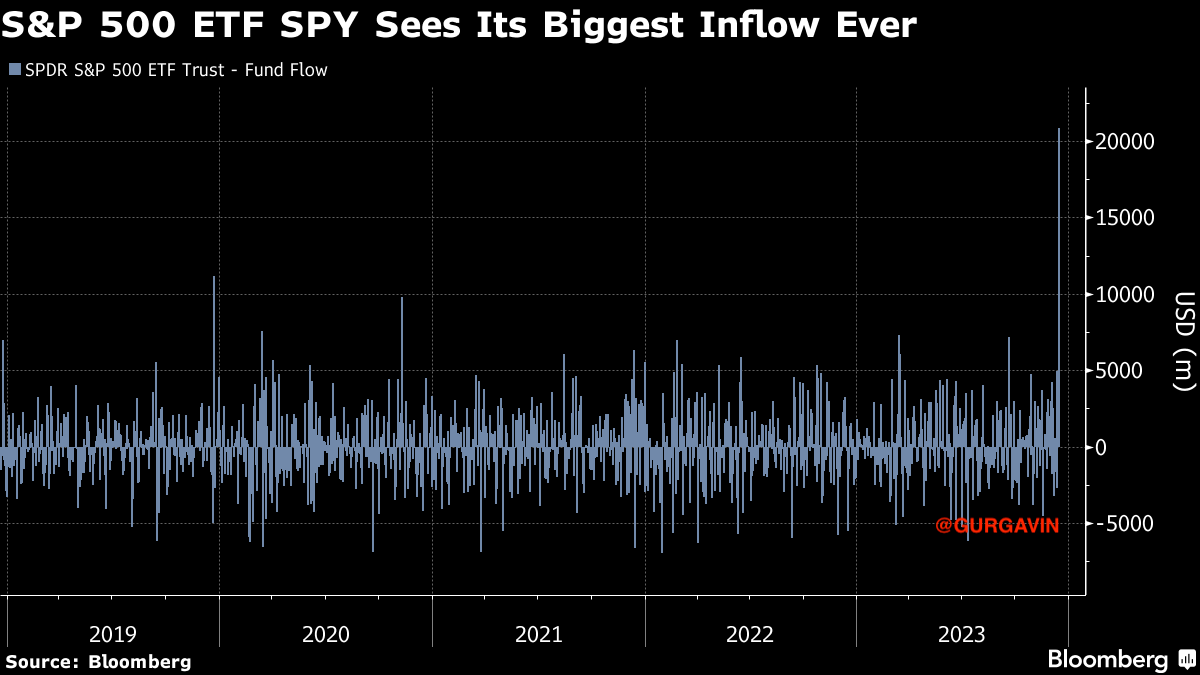
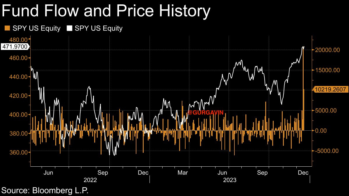
Last week’s flows into the stock markets between the largest this year.
https://twitter.com/dailychartbook/status/1736427283265868098/photo/1
2 Likes
2 Likes
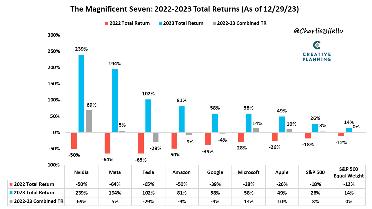
Cool overview
https://twitter.com/charliebilello/status/1740876409231556661?t=CvTrtgAcDiZ0XR1Ry2uI0A&s=19
Market breadth is again very weak. Only a few stocks are going up taking the index up, while the majority are going down.
The last time I saw this was in Q3 2023, when we experienced a significant correction.
I have not studied this enough to understand if it’s going to happen again or not, or what is the exact correlation, but it could be indication of underlying market weakness
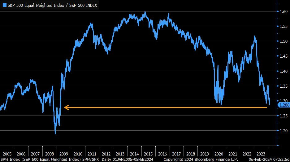
The ratio of equal-weighted S&P 500 relative to cap-weighted S&P 500 lowest since 2008- 2009
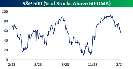
The S&P 500 is at/near an all-time high but only 57% of stocks in the index are above their 50-day moving average.
https://twitter.com/bespokeinvest/status/1754843898017382449/photo/1
1 Like
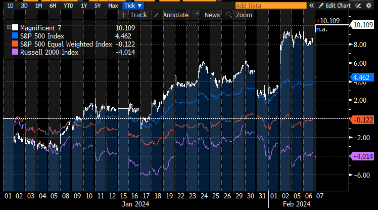
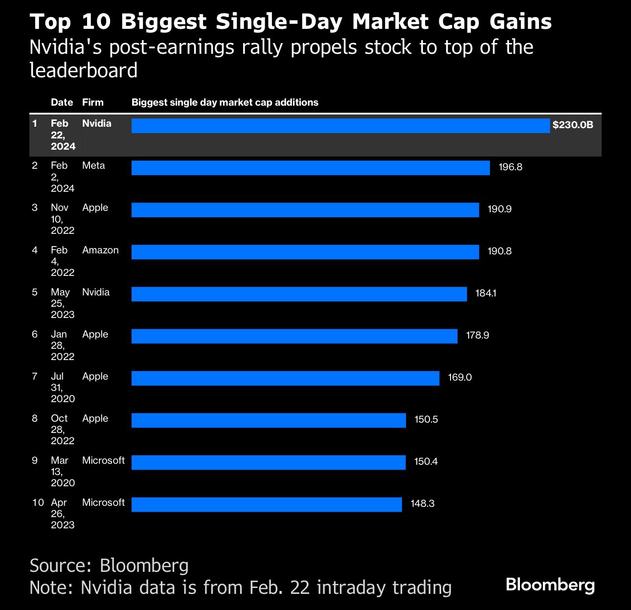
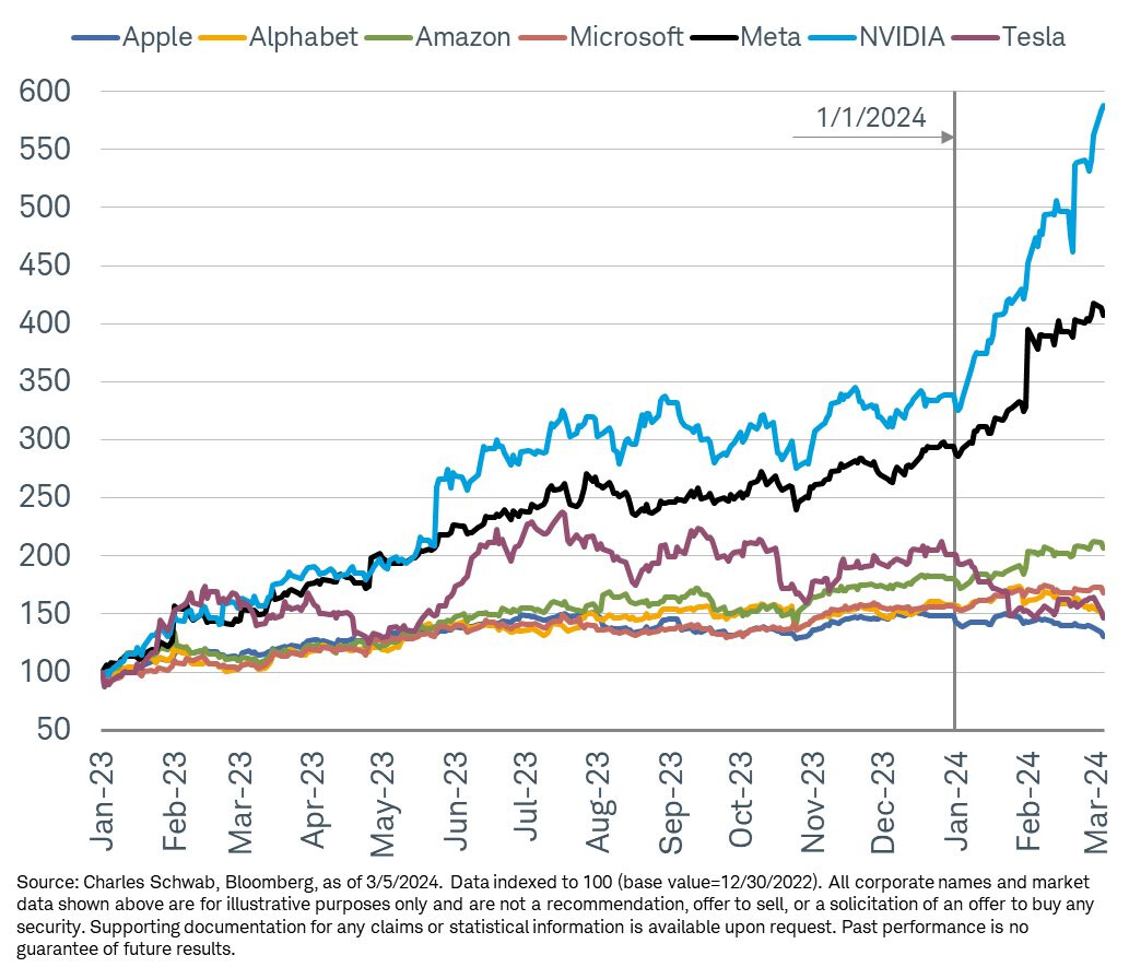
These Meta and NVDA moves biggest in history.
https://twitter.com/gurgavin/status/1760742812910506343/photo/1
1 Like
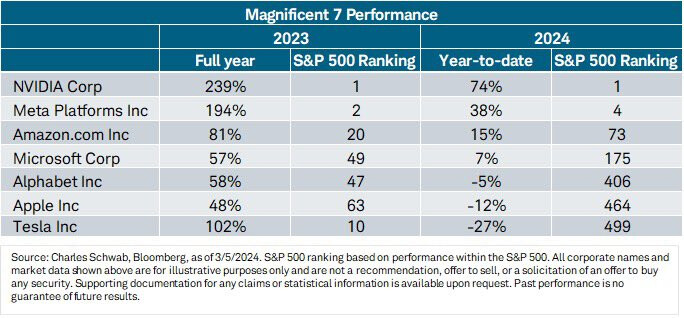
Mag7 performance for 2024. Most companies are weak except for Meta and Nvidia.
https://twitter.com/LizAnnSonders/status/1765439111744065602/photo/2
1 Like
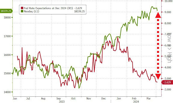
Huge disconnect in the stock market currently.
This rally was ignited when rate cut expectations started to increase in November. But it hasn’t caused any significant correction that these cuts have been priced out in its majority
And not saying it will, anyone can agree on the resilience of this market. (At least the big stocks). So it would be dangerous to bet against it with this momentum, but makes me more cautious at the same time.
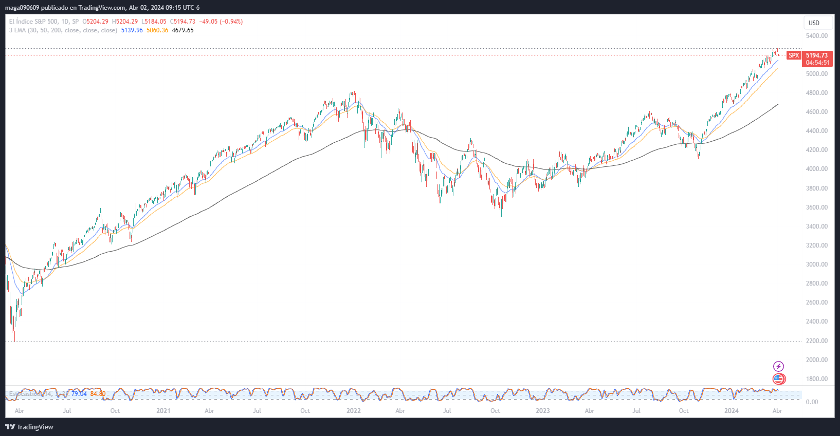
The price action is also looking extremely similar to 2021, when it was going up, with just minor corrections along the way.
1 Like
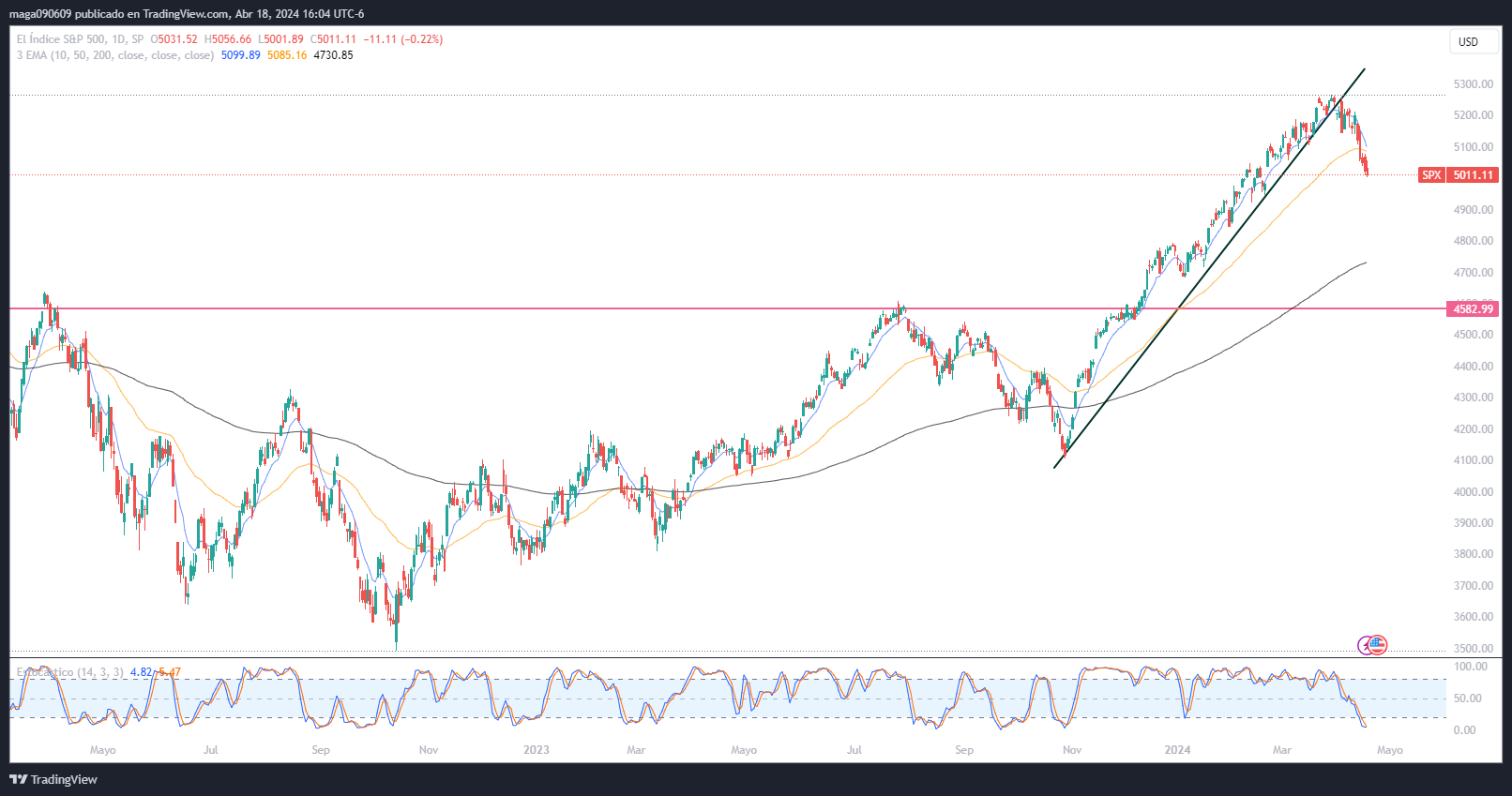
The SP500 has broken the upside huge trend/momentum it had since November and has now corrected close to 5% after inflation number mostly.
We are entering the earnings season at a moment when investors are probably being a bit more cautious or locking profits.
1 Like
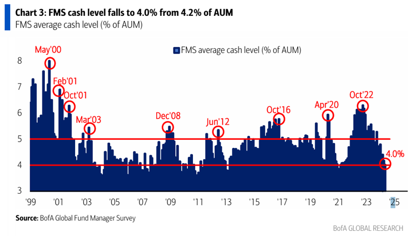
Interesting chart. Interesting cash levels are never that high but currently they are already on the low side.
For me, it seems this kind of data is way better for predicting bottoms than peaks. Could still be indicative of how much upside could be left, but imo overbought conditions can last longer than expected than oversold ones.
1 Like
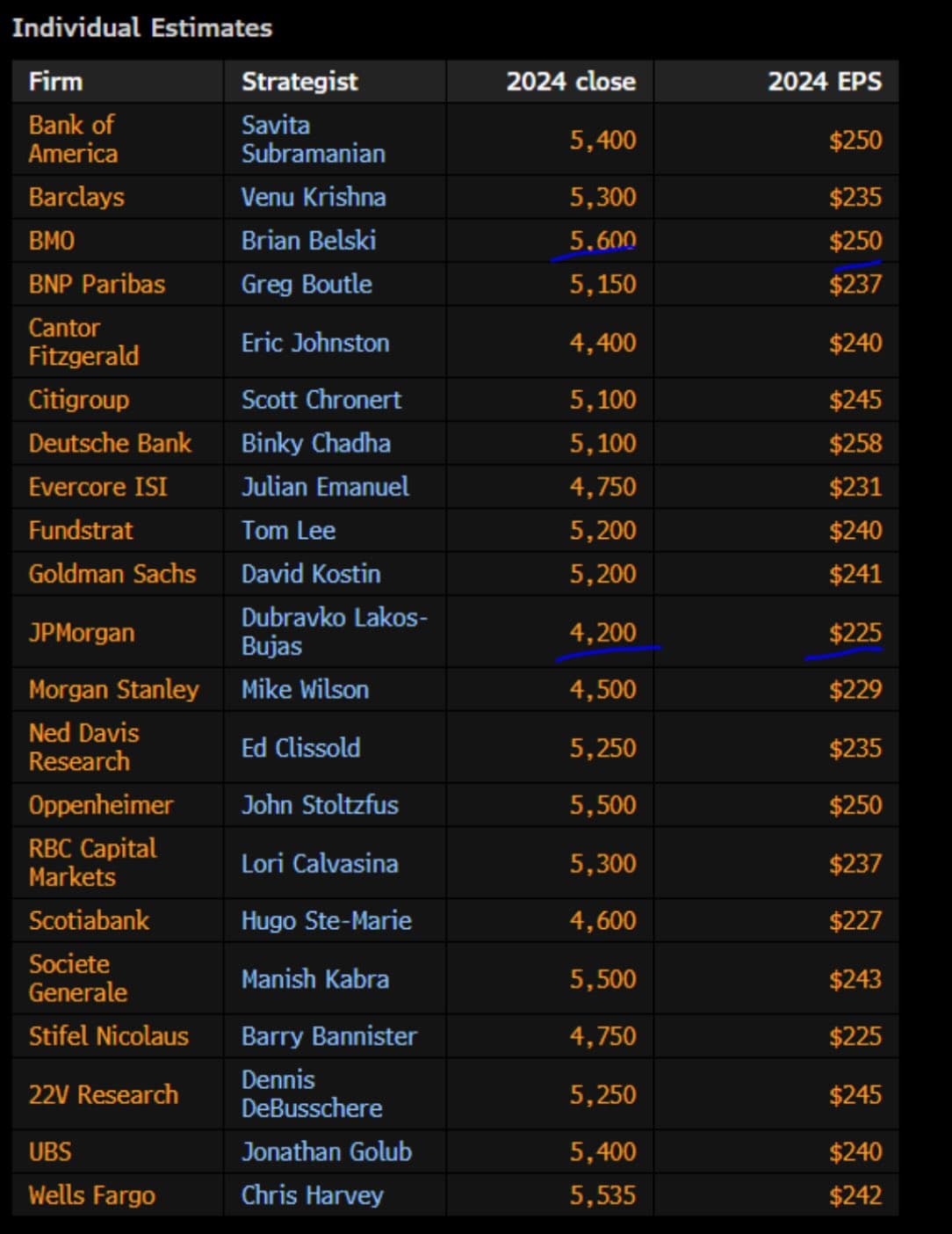
Current targets for SP500, with EPS estimates.
All over the place, will be interesting to know at year’s end who got it right.
1 Like
What are the latest predictions of people we are following like Ed Yardeni?